
Discover a Collection of Hotels that use vibrant colors in their design, and learn why this is a great idea!
5 mins readAll Hoteliers wish to create a unique environment that represents their property’s personality. But when the time comes to decide which way to go design-wise, either for a new-built property or before a renovation, the struggle is real.
When brainstorming on the matter, the color palette that will dominate the hotel’s premises is the first thing that comes to mind. Many Hoteliers choose neutral & basic shades with maybe one or two hints of color, since this the safest choice, that almost every guest will like.
However, there is a dynamic alternative, that not many dare to try. But when it’s done the right way, it can be a fascinating design statement, which will make your Hotel stand out. Colors, especially in large amounts and when covering big surfaces, can instantly affect your guest’s mood and psychology. Evidently, when used in the right way, colors can create an intense experience, hence strong and positive memories. Moreover, colorful environments are not something that is common to travellers, not only when visiting hotels but in their domestic environments too. As a result, the experience of staying in a place with an unexpected colorful design can trigger the traveller’s curiosity and excitement.
Let’s explore a few examples of hotels using a vibrant color palette for their interiors, along with a mini-study on the choices made.
Color balance is the key!
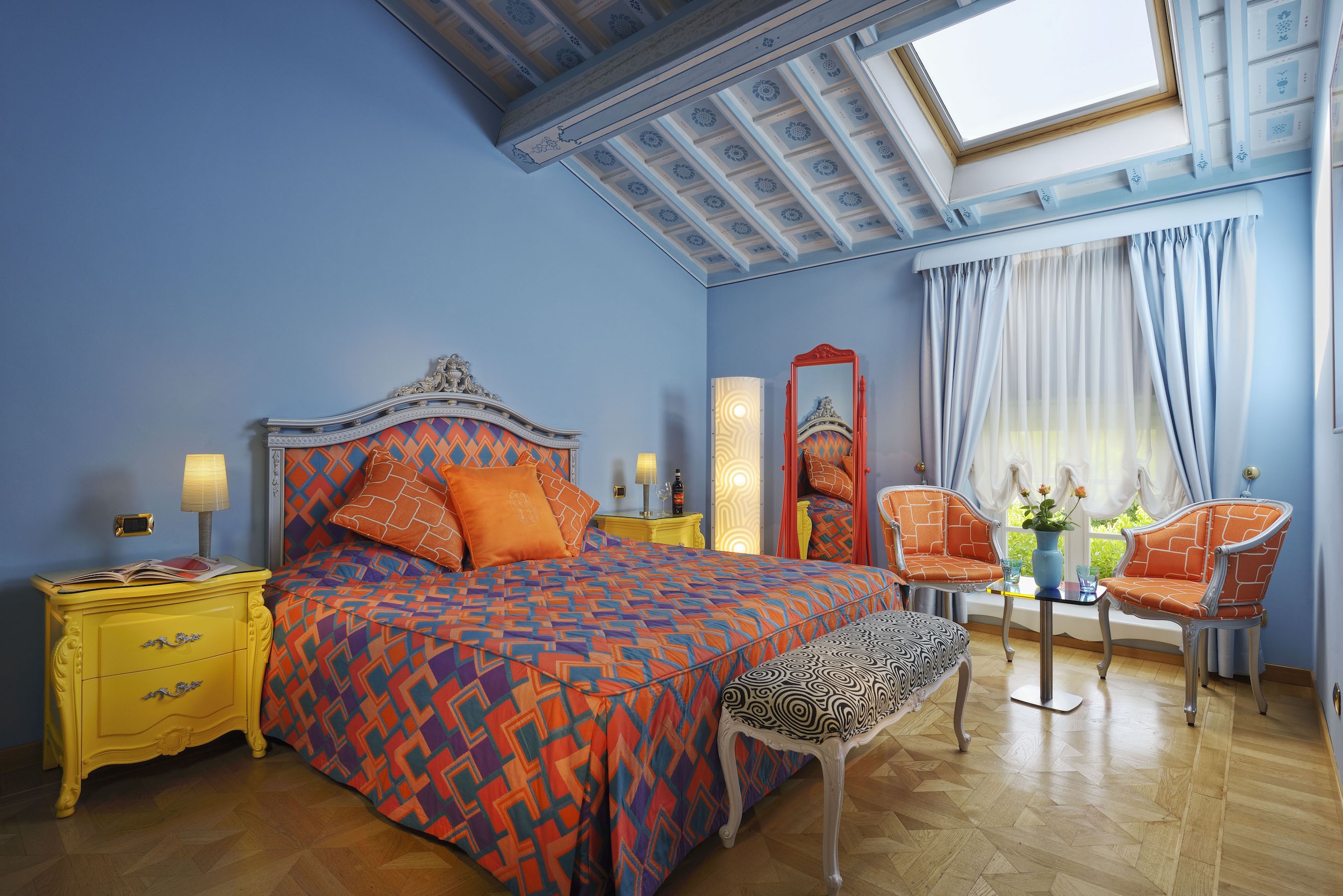
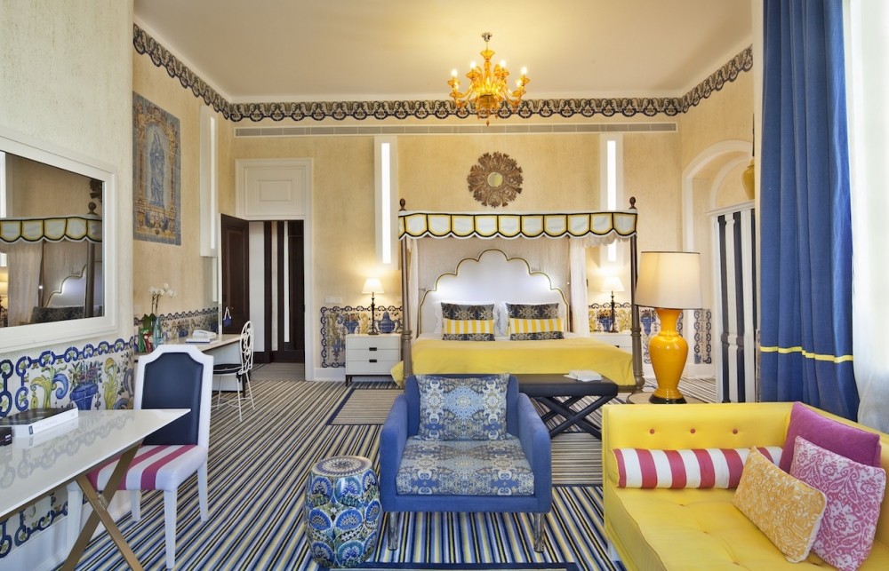
Byblos Art Hotel Villa Amista, San Pietro In Cariano, Veneto, Italy
Above, you can see a firm example of going all the way with colors. Byblos Art Hotel Villa Amista, not only chose lively colors and daring combinations but also included bold prints. The main surface, which is the walls, is colored in a soft blue color, a wise color-base for such an intense room. Based on color psychology, blue is associated with calmness and serenity, so it is a color that will subconsciously make the hotel’s guests relax and offer them a Zen experience.
Choosing this specific color for the main surface is a very smart trick, especially since the rest of the colors and patterns are rather ‘loud’ – in a good way. The orange tones of the duvet pattern and the chairs, bring out happiness and energy. At the same time, the bedside cabinets’ bright yellow gives a happy and cheerful tone. The red in the mirror obviously represents passion and intensity, as well as love (for our romantic readers). All these color elements, along with the serenity of blue, create a balance, so we have a daring colorful environment done just right!
A White base makes it all work!
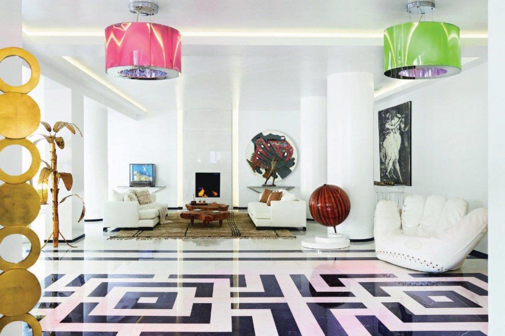
Grecotel Pallas Athena, Athens, Greece
Grecotel Pallas Athena is another inspiration for hoteliers wanting to explore color options in their hotel’s design. Here, the decoration base is not an actual color, but the timeless white! Once again, the largest surfaces host a calm and neutral shade — in this case, the clean and fresh white, creating the ideal environment for some playful tones to pop up and add character.
The bold print on the floor manages to enhance the pink ceiling light, which has a matching green one on the opposite side. These two lights are of the same design, but feature different colors — pink and green — yet in the same tone and color grading. This color combination is a very popular one, and they complement each other really well. At the same time, the more earthy elements of the furniture’s wooden textures bring balance, while gold pieces and details create a luxurious feeling.
Black makes colors stand out and wood adds a rustic feel
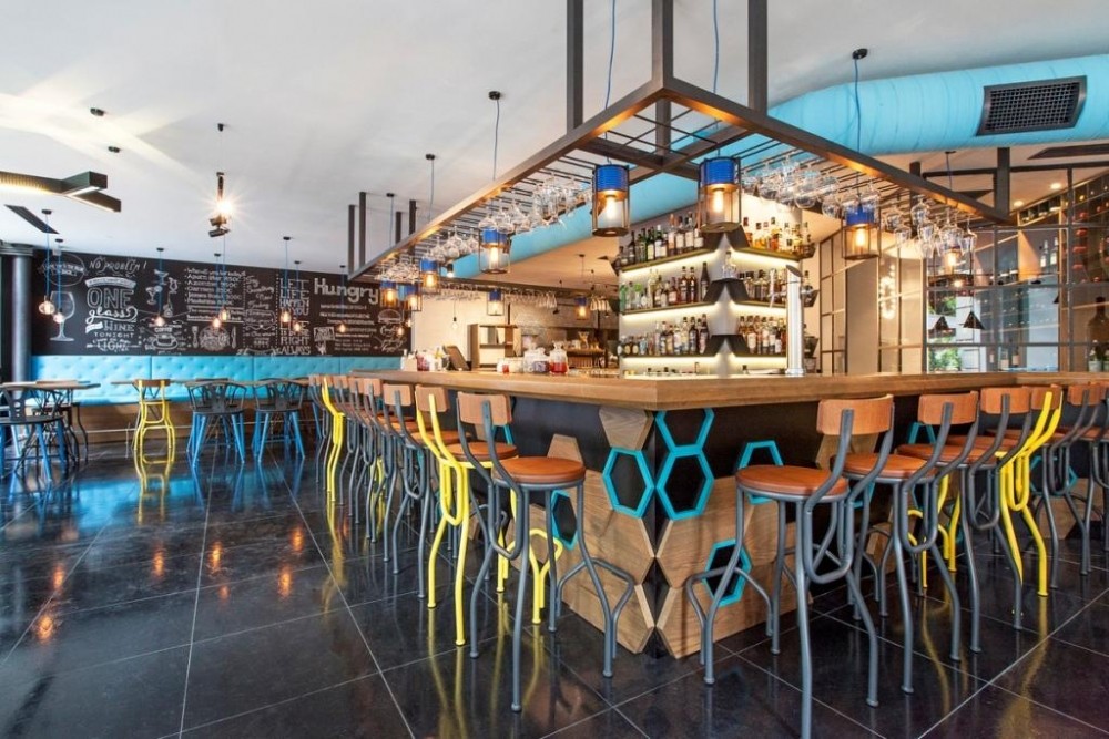
Excelsior Hotel, Thessaloniki, Greece
At Excelsior Hotel, dark tones manage not only to create balance but also to make the already vibrant colors stand out even more. The flooring is a smooth black surface, while black appears on the walls as well. In the same aspect, the majority of the color choices used is of dark tones and tints. Only some of the chairs & tables have bright yellow frames. Additionally, a couple of décor details like the bar lamps and hive-like patterns, use vibrant shades of blue. In this case, the colors may not be many or too bright, however, due to the darker background, they manage to really stand out in the room!
Dare a colorful hotel exterior!

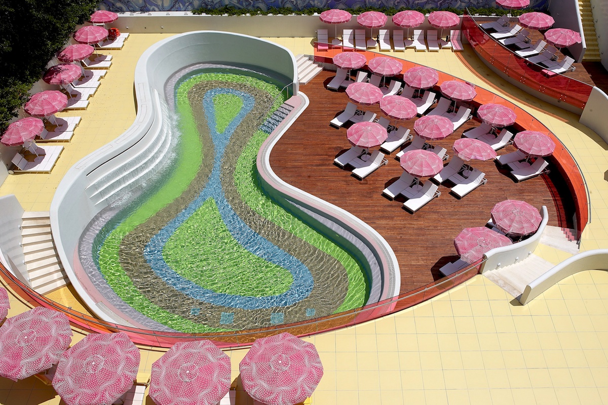
Semiramis Hotel, Athens, Greece
A unique hotel design can not be expressed just in the interior spaces. Hotel Semiramis presents an excellent example of a colorful exterior, using the same color palette used in all hotel areas. Bright Green holds the major part of the pool’s bottom, while all other colors just add a calming effect. Surrounding the colorful pool, the pink umbrellas create a playful and unique environment. The yellow flooring has a softer tone, balancing everything out, while the wooden decks give earthy hints.
Find more examples of colorful hotel design on the below slider and get even more inspired!
The Author
You Might Also Like


